Check out this website has some really amazing work on there
http://www.typographicposters.com/
and i especially like this guy
http://www.typographicposters.com/#/daniel-grein/

Thursday, 28 October 2010
Visual research

Really great book, with a great chapter on 'audience and message'. Has alot of nice pictures too.
Another Letterhead!!!

I'm Struggling to get this letterhead completely perfect, i think i might have got it.
Helvetica Companions
Great article on combining helvetica with other typefaces.
http://www.fontshop.com/blog/?cat=92
http://www.fontshop.com/blog/?cat=92
Media City UK Illustration First Go

So heres an idea for my media city illustration, the idea of "dont leave me on my own" is abit of a joke to say i dont want to go get a job there with a bunch of people that i dont like. I quite like the way bouncing the file back and too between illustrator and photoshop has given a weird sort of blur to some of the stuff. Happy Accident.
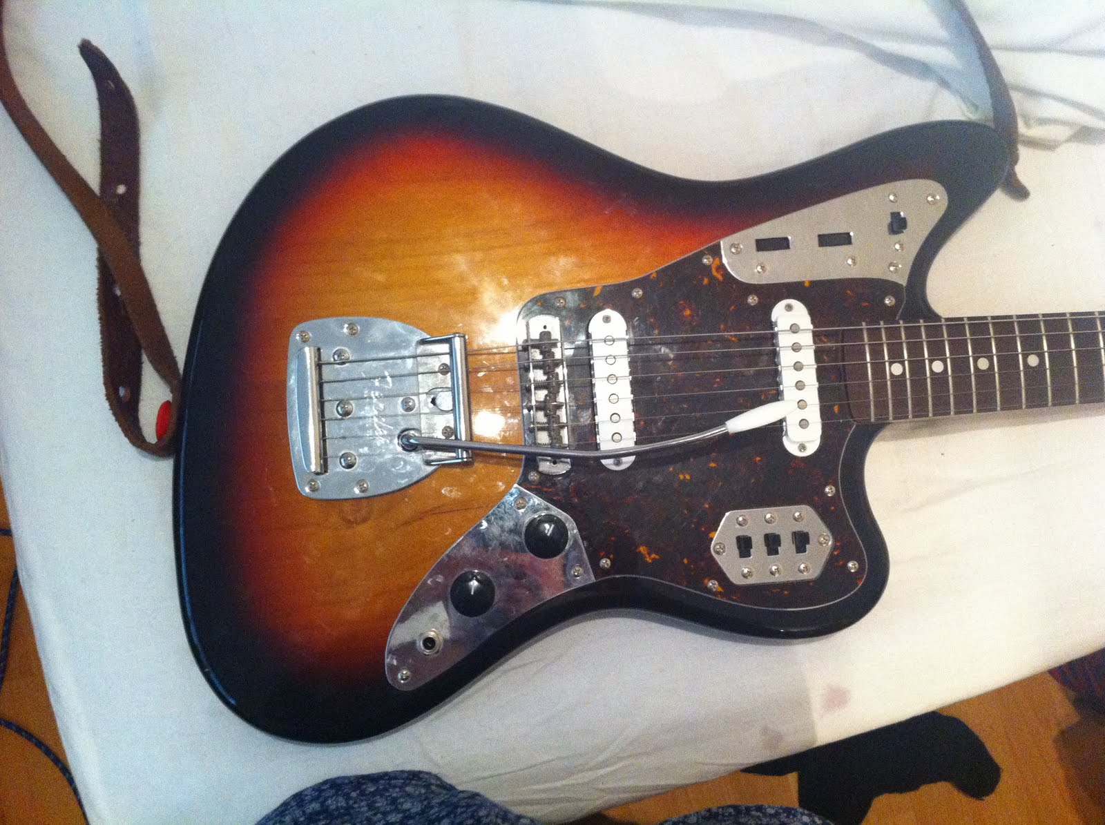
Another Overcast Day
The awful weather is making it pretty hard for me to get any decent shots for my illustration, have been working on a new idea just incase i have the same problem tomorrow.
Heres what I've spent the afternoon doing instead.
I've been playing my absolutely beautiful fender jaguar guitar, with my array of FX pedals.
Enjoy.


Tuesday, 26 October 2010
Salford Quays


Took a walk to Salford quays last night, was too dark to take any photos but i think that the builds will look pretty good with fish eye/wide angle lens style photography.
Media City UK Illustration.
I want my illustration to attract people like me. People that enjoy design and music, as these are the kinds of people i want to end up working with. So i want my illustration to have the same ethos as my logo and branding but also want to take a step away from the colour scheme and have it be abit more in depth than just simple shapes.

Business Card


Sunday, 24 October 2010
red wine research
I've trawling the net for influences for my illustration.
Heres Wim Crouwel.
http://www.youtube.com/watch?v=I5y3px4ovxE
and heres Stefan Sagmeister.
http://www.youtube.com/watch?v=WCxXqRwaNu8
Both have very different views on design but ideas are starting to come together
Friday, 22 October 2010
New Letterhead


Right heres the new letter head, i did one in colour and one in black and white so i can see how they'd come out on faxes etc.
let me know what you think
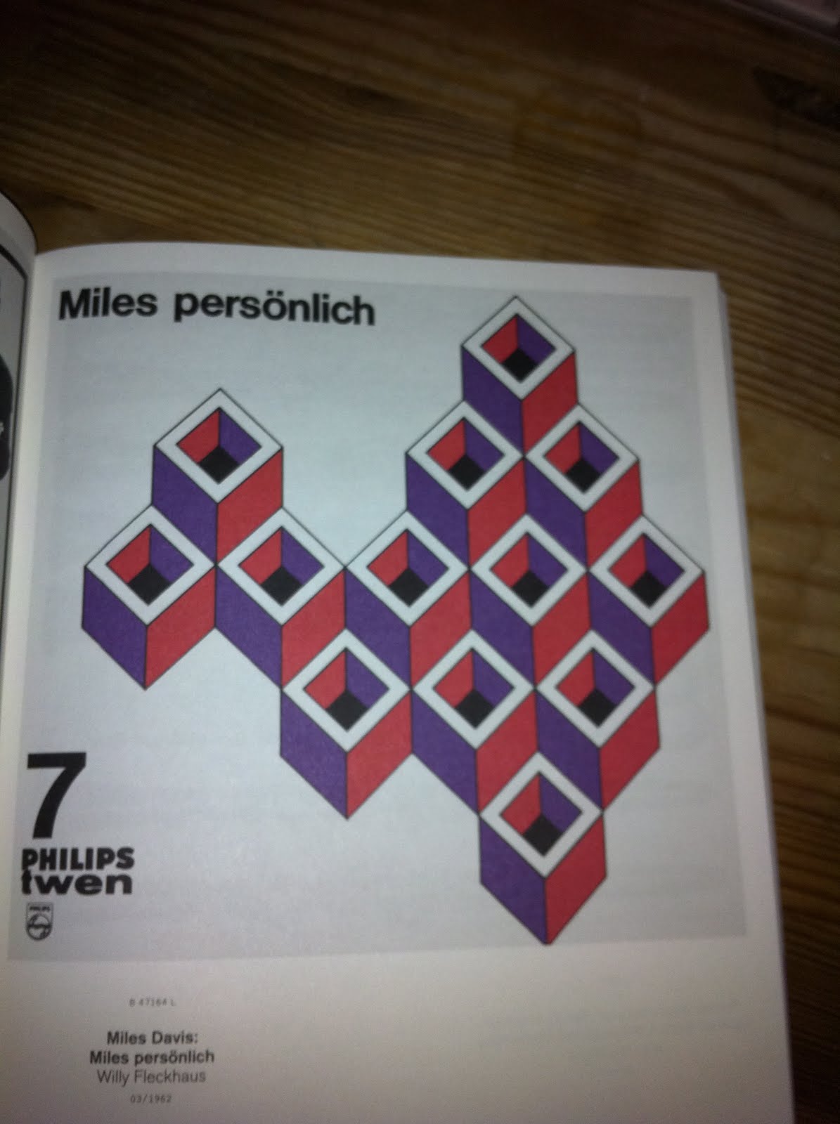
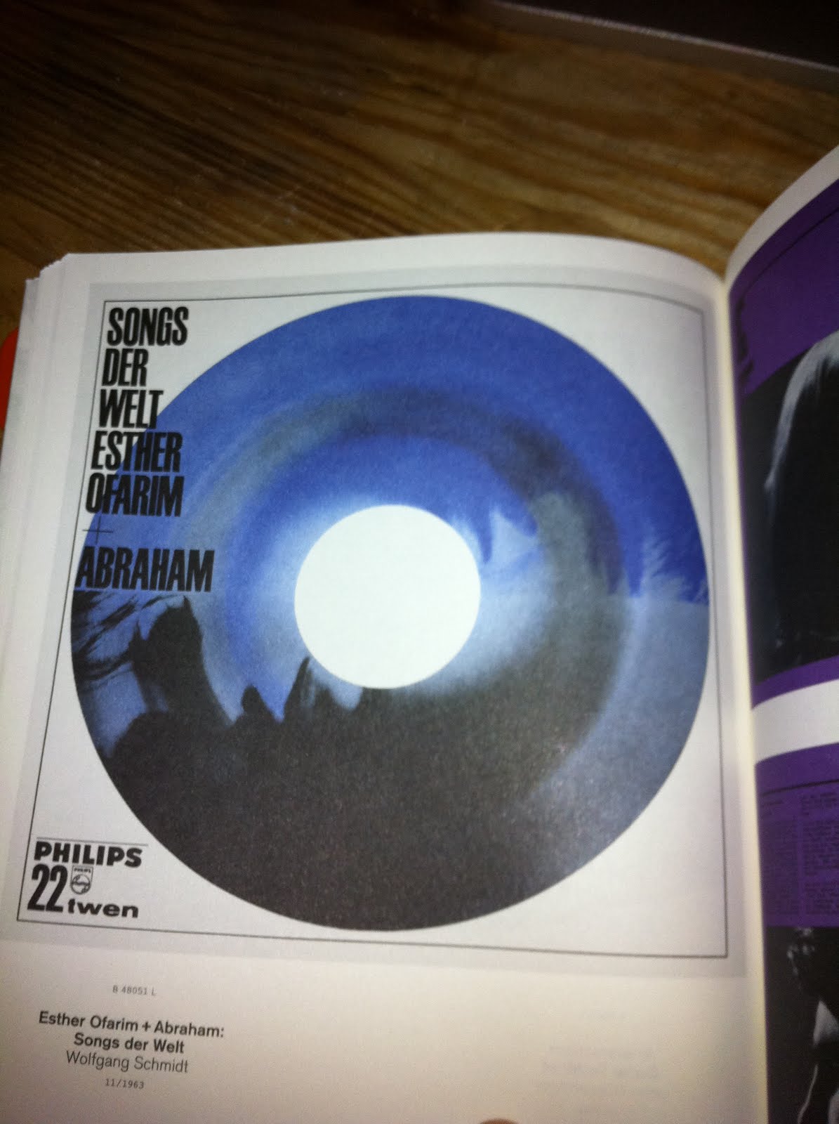
Influences on my illustration and new letter head
A friend lent me a book on old philips twen record sleeves, there are a few different artists in there, but a guy called Willy Fleckhaus really caught my eye and had the same feel as where i want my branding to go.
So i'm going to re-do my letterhead with this in mind as the first one is abit boring, and shit basically. But its also going to influence my Salford quays illustration.


Thursday, 21 October 2010
Developing the business card idea

Some rough drawings for the business card.
Normal business card size, as i want it to be taken seriously and not as a novelty.
The front will just be the 'Back to Mono' Logo with a dye cut hole the size of that in an LP or 45
The back will have the look and feel of the centre of an LP or 45 but with all the 'a side' '45 rpm' stuff replaced with my details.
Its going to be really important that the text is perfectly sized, its perfectly coloured because if it doesn't look exactly like a record centre then the is idea gone and it will just look odd.
As my logo has a lot of white space i think the contrast of the front being almost all white then the reverse being a very strong colour (probably red) the contrast will be really striking.
Business Card Ideas
Had, what i think is a good idea for my business card on my way home. Now my logo is based around a record and record player arm. So my idea was to have the business card look like a 45 rpm record.
So i googled decca and stax records to get some feel for how they looked, then i pulled out some of the less shameful records from my collection that that i could get a proper look at.


Wednesday, 20 October 2010
Russian Constructivism

A friend of mine suggested the logo reminded her of russian constructivist work, i hadnt intentionally gone on that direction but it certainly has the same ethos
Not overly related
 In berlin i popped over to see Mr Spiekermann himself, well at least i stood outside his office

Final Logo

Here we go the final product. I'm really pleased with it. It will appeal to the music based clients i'd like to attract and also i think its eye catching enough to show how i can make a brand stand out
Logo Development Mk. III
 Some of the rough ideas polished off. I'm pretty pleased with all of them so any feed back would be nice.

Logo Development Mk. II
 This is the logo i'm going with, sorry about all the scribbly shit round the sides helps me to think abit.
Thinking of maybe having concentric circles rather than just just the one ring round the red circle.
Really getting a good feel from this and there is a sub-conscience suggestion of a bull's eye with the red circle.
Logo Development
 First Ideas for the logo, definetly going with a san serif font for the name.
Back to Mono really feel like a good name for the way i work and for the people i'd want to work with
Heros of the graphic design world
The designers that i most admire and every time i see a piece of work by them i feel almost blown away by the simplicity of their solution.
First and foremost is Erik Spikermann, for me he is shares the perfect idea of what graphic design should be, it should make your life easier without you knowing it exists. He proved this with his overhaul of the Berlin U-Bahn signage system.
Secondly is Stefan Sagmeister, he represents for me the fact there are no boundaries for designers, and this i think is one of the most important things to remember about original design.
Also Massimo Vignelli and Wim Crouwel, arguable two of the great masters of design in 20th & 21st century are a big influence on me
Primary Audience
The aim is to engage with big, already established brands that want to overhaul their general look and feel, brands like 'American Apparel', and even more distinguished brands, such as Saville Row taylors, that are in need of attracting a younger audience.
Also i would like to work with bands to create artwork and branding for them
The Back to Mono Mission Statement
Back to Mono Designs aim to provide, original solutions to everyday problems. Specialising in Logo Design & cooperate identity, product branding and packaging. Also specialising in band artwork.
Back to Mono, want back to basic design, clear understanding of timeless design elements, such as typography and grid layout, but with contemporary twist.
Subscribe to:
Posts (Atom)